
Karen Lazar Design
A custom-built Shopify storefront for a fast-growing 14k gold-filled jewelry brand — designed from scratch, engineered for stack-based shopping, and tuned for international scale.
Published in 2023
E-commerce Strategy
UX & UI Design
Shopify Theme Development
Custom Filtration System
Custom Shipping Configuration
Performance Optimization
Brand-led Web Design
Services
Shopify E-commerce Platform
Custom Theme
Bundled Stack Builder
Multi-tier Gift Card System
Style Guide Experience
Deliverables
- Website
Links
Karen Lazar Design is a luxury 14k gold-filled jewelry brand known for its anti-tarnish signature bracelets, curated stacks, and editorial-grade product photography. We designed and built the entire Shopify storefront from scratch over a four-month engagement — from the brand-led visual system and information architecture to the custom filtration engine, bundled stack experience, multi-tier gift card flow, and custom shipping configuration. The result is a fast, beautifully restrained shopping experience that lets customers move effortlessly from inspiration (style guides, Instagram UGC, press) to a precisely sized, multi-variant purchase, while giving the brand the operational headroom to handle a high-traffic, internationally shipping catalogue without compromising on the aesthetic.
The challenge.
Karen Lazar Design had built a cult following around its 14k gold-filled signature pieces — anti-tarnish, layerable, and editorial enough to land in InStyle, Town & Country, and Elle. But the catalogue had outgrown its storefront. Dozens of variants per piece, ten size options, a growing gemstone and diamond range, curated stacks, gift cards across multiple price tiers, an active showroom in Brentwood, and a steadily growing international audience were all competing for the same attention on the homepage. The brief was clear: design and build a Shopify storefront from scratch that could carry an editorial fashion-brand aesthetic while quietly handling the operational complexity of a multi-collection, multi-currency jewelry business.
The hardest part was content choreography. The product range crosses Signature, Gemstone, Diamond, Fine, and Kids, with overlapping use cases — birthstone gifts, bridal stacks, everyday layering, statement pieces — and a customer who often arrives looking for a feeling ("a delicate stack for spring") rather than a specific SKU. The site had to make that journey feel intuitive without burying the brand's quiet, refined visual tone under filters and merchandising widgets.
Designing the storefront from scratch.
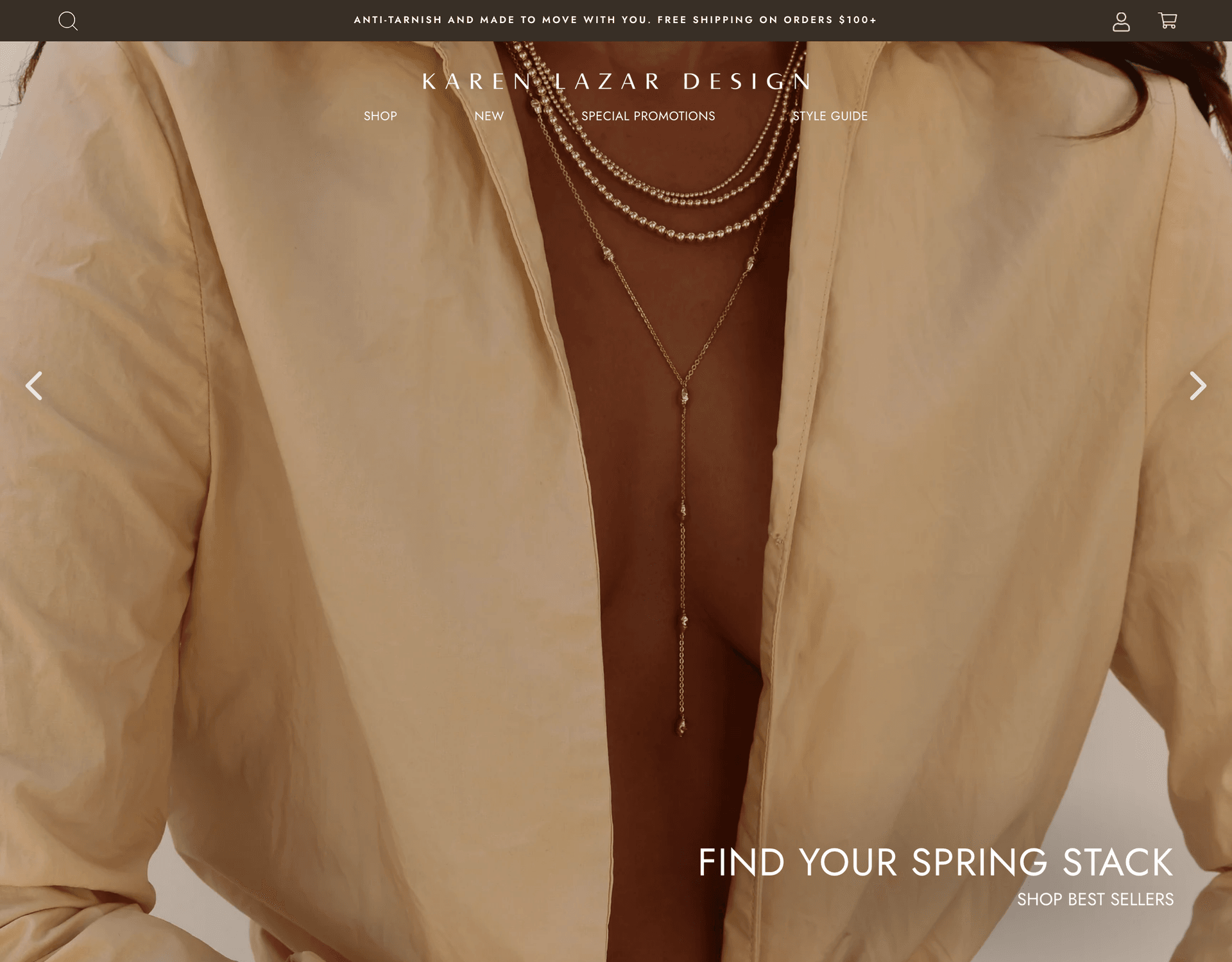
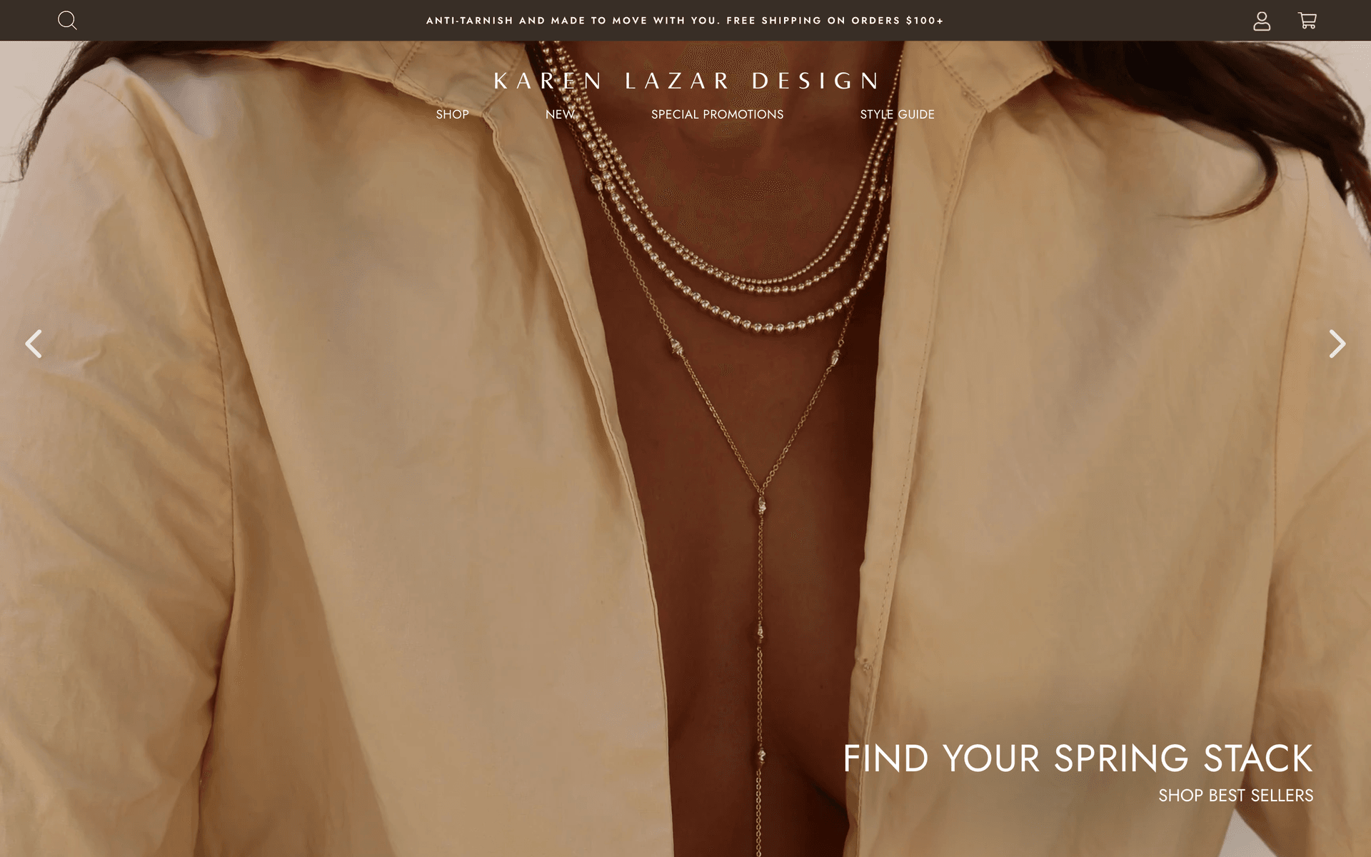
We started in design, not in code. Over the first phase of the four-month engagement we mapped the full information architecture, drafted the page system, and designed every key template against the brand's existing photography and tone of voice — soft neutrals, generous whitespace, restrained typography, and product imagery that reads more like an editorial spread than a typical e-commerce grid. The hero sequence centers a single emotional cue ("Find Your Spring Stack") above a large lifestyle image, with navigation pared down to four entry points: Shop, New, Special Promotions, and Style Guide. Everything else — filters, badges, promotional ribbons — is hidden until it earns its place on the screen.
Engineering a Shopify build that disappears behind the brand.
With the design system locked, we built the storefront on Shopify from the ground up — custom theme, custom templates, custom merchandising logic. The goal was for the platform to be invisible: no off-the-shelf theme tropes, no app-stitched UI, no jarring shifts between marketing pages and product pages. Every collection, product, and content template shares the same restrained type system, the same rhythm of imagery and whitespace, and the same interaction patterns, so a customer moving from a press feature to a Style Guide to a product variant page never feels handed off between systems.
Behind the scenes, the build was structured around the operational realities of the brand: a fast-growing catalogue, frequent collection drops, recurring promotional moments (gift guides, seasonal stacks, holiday capsules), and a need to merchandise the same products across multiple narratives without duplicating content. The CMS structure makes it easy for the team to spin up a new edit — a "Spring Stack," a press wall update, a featured collection — without touching code.
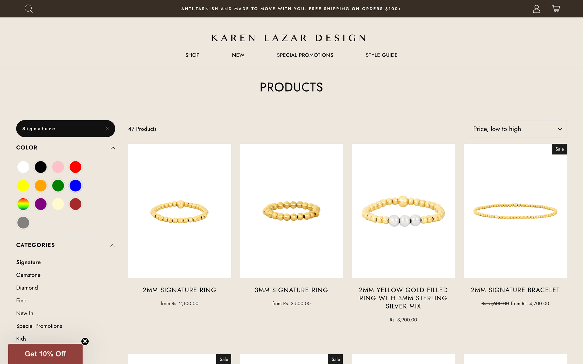
A custom filtration system built around how customers actually shop.
The Signature collection alone runs to nearly fifty products, and the wider catalogue multiplies that across gemstones, diamonds, fine pieces, and kids. We built a custom filtration system that lets shoppers slice the catalogue the way they actually think about jewelry — by color (yellow gold, rose, silver, mixed), by category (Signature, Gemstone, Diamond, Fine, New In, Special Promotions, Kids), by price, and by sale state — with sticky filter chips, a clear active-state for the current selection, and a "Price, low to high" sort that reorders the grid instantly. Filter combinations resolve fast, persist across navigation, and feed cleanly into the analytics layer so the brand can see which entry points are converting on which collections.
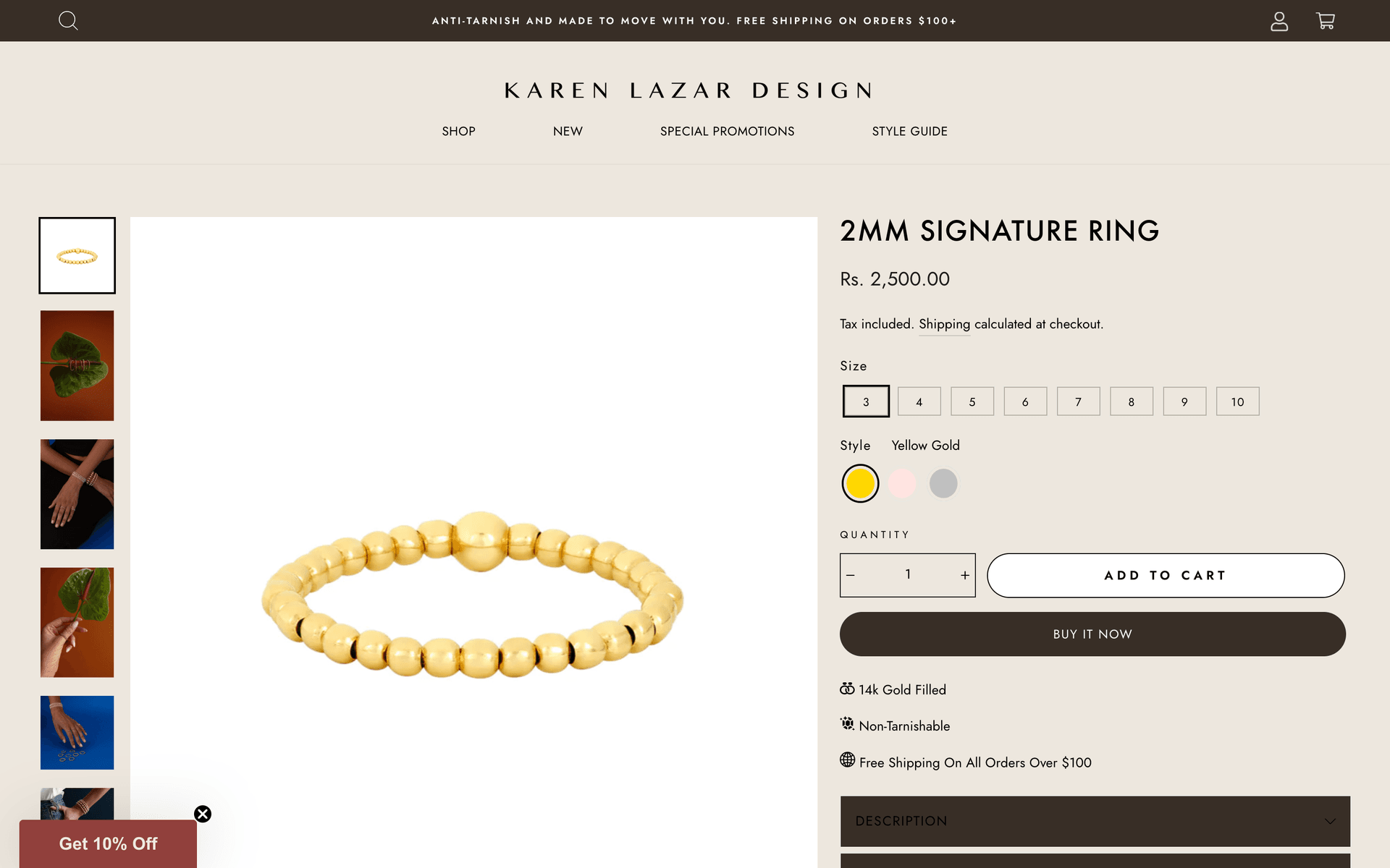
Variant logic that survives ten sizes and three styles.
Most pieces in the catalogue ship in up to ten ring sizes and three style finishes (Yellow Gold, Rose, Silver), which on a default Shopify setup would explode into a confusing variant matrix. We rebuilt the product page around a clean, two-step variant picker: size as a row of compact, tappable chips, style as color swatches, with availability, pricing, and the gallery thumbnails updating in real time as the customer moves between options. Trust cues — 14k Gold Filled, Non-Tarnishable, Free Shipping On All Orders Over $100 — sit immediately under the buy box, where they can do the work of converting a hesitant first-time buyer without dominating the page.
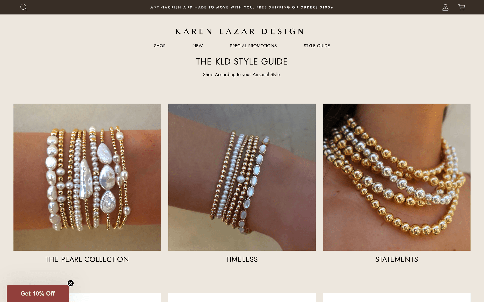
Stack-based shopping and a Style Guide that doubles as discovery.
Karen Lazar customers rarely buy a single piece — they buy stacks. We built a dedicated Style Guide experience ("Shop According to Your Personal Style") that organizes the catalogue around aesthetic intent rather than SKU: The Pearl Collection, Timeless, and Statements, each anchored by a full-bleed lifestyle image and a curated edit underneath. The same surface is reusable for seasonal stories — Spring Stack, Birthstone Stack, the Karen Stack — so the brand can launch a new merchandising narrative in hours, not weeks, and customers always have a clear path from "I want a look" to a buyable bundle.
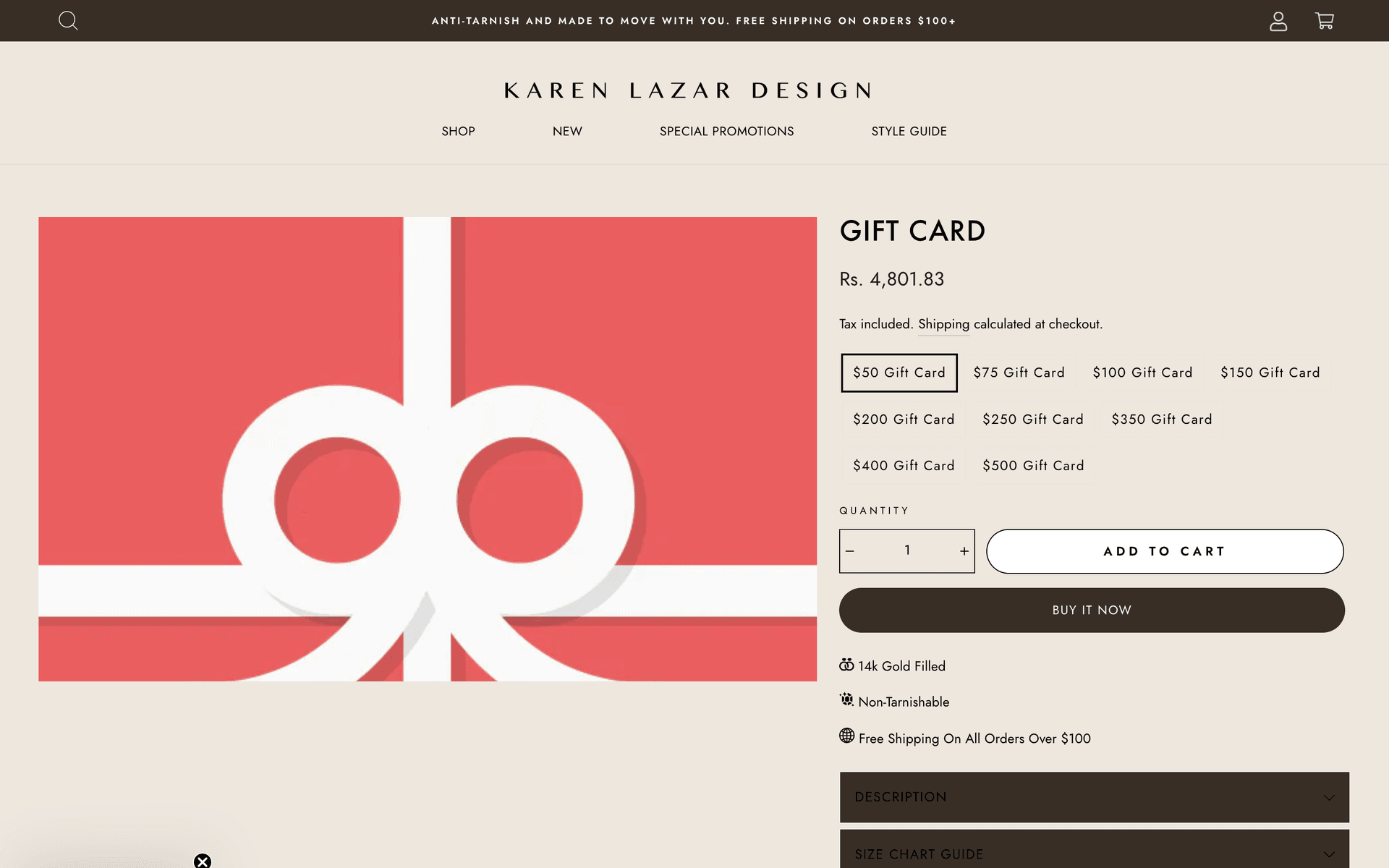
A multi-tier gift card flow.
Gift cards are a meaningful share of the brand's revenue, especially around the holidays, so we treated them as a first-class product rather than a checkout afterthought. The gift card page mirrors the design language of the rest of the catalogue — same buy box, same trust cues, same typography — but exposes nine fixed denominations from $50 to $500 in a single tap-to-select grid, with quantity, Add to Cart, and Buy It Now flowing through the standard checkout. The result is a gift purchase that feels considered and on-brand, not transactional.
Custom shipping and international scale.
The brand ships internationally and runs a free-shipping threshold ($100+) that's prominently featured in the announcement bar at the top of every page. We configured custom shipping rates that reflect real-world fulfillment economics — different bands for different destinations, a clean interaction with the free-shipping promotion, and accurate, predictable totals at checkout. Combined with multi-currency support across USD, EUR, GBP, and other key markets, the storefront handles a meaningful share of international orders without surprising customers at the final step.
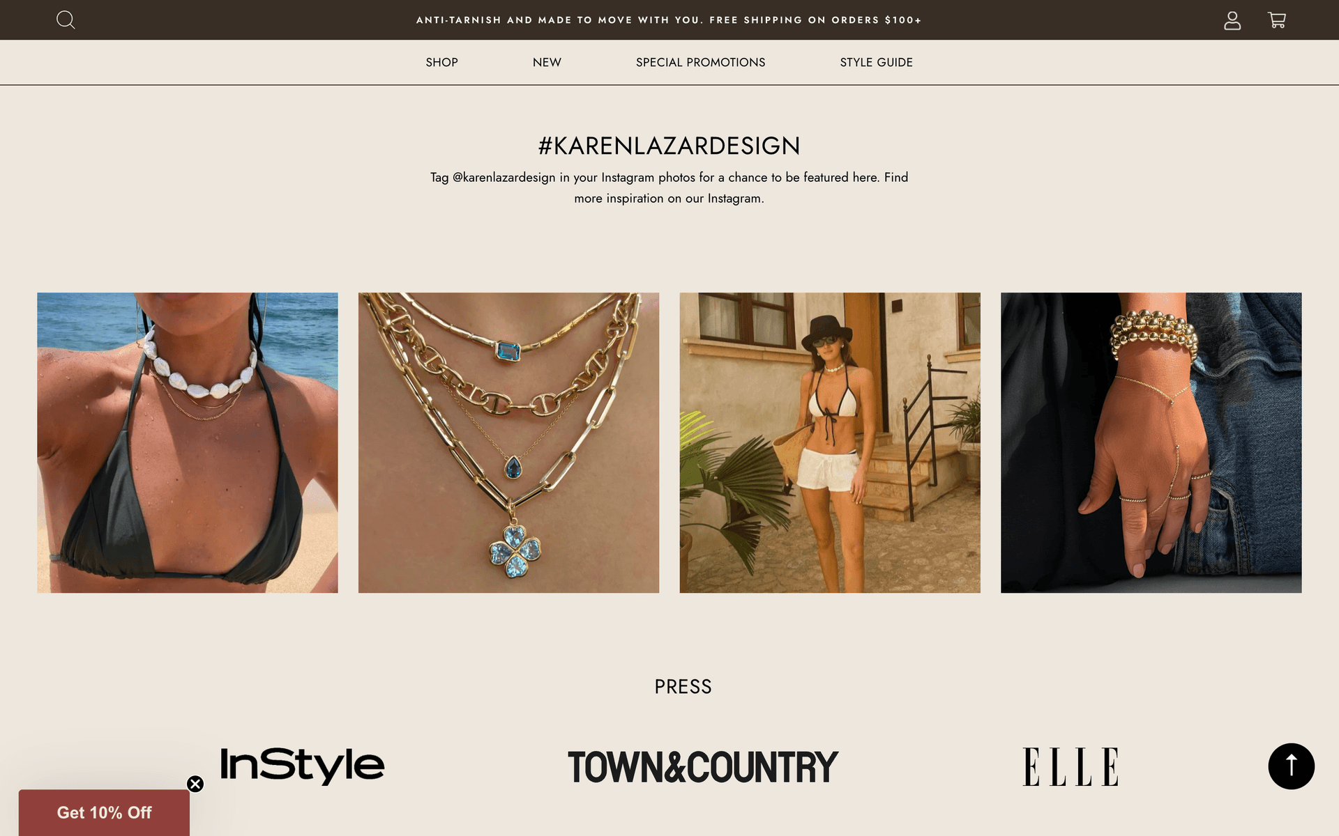
Press, social proof, and community.
Below the fold on the homepage, we built a tightly merchandised social-proof block that does a lot of the brand-trust work in a single screen: an Instagram-tagged UGC strip pulling real customers wearing the pieces, a press wall surfacing InStyle, Town & Country, and Elle, and a returning entry point to best sellers. The block was built to be editable from the CMS so the team can rotate UGC, swap press logos, and refresh the featured edit without engineering involvement.
"The team understood the brand from the first conversation. They built the entire Shopify store from scratch around how our customers actually shop — stacks, style guides, gift cards, sizes — and the storefront has carried us through a steady jump in traffic without us having to rethink the foundation."
Sydney
Client at Karen Lazar Design
Results & impact.
The storefront went live as a fully custom Shopify build inside the four-month window. The signature catalogue now scales cleanly across collections, color and category filters resolve in a single interaction, ten-size variant logic and three-style finishes work without UI clutter, the multi-tier gift card flow handles the brand's seasonal gifting volume, and custom shipping rates support international orders alongside the free-shipping threshold. The Style Guide and Spring Stack surfaces let the brand merchandise the catalogue around feeling and occasion, not SKU lists, while the press wall and Instagram UGC strip do the trust-building work below the fold.
The site has carried steady, growing traffic since launch and continues to be the central commerce surface for the brand — alongside the Brentwood showroom and the brand's editorial press footprint. More importantly, the platform was built so the team can keep merchandising, dropping new collections, and running seasonal stories without the storefront becoming a bottleneck. That was the real brief: a Shopify build sophisticated enough to disappear behind the brand, and structured enough to carry it as it grows.
What are you looking for?
Please choose an option below